> ## Documentation Index
> Fetch the complete documentation index at: https://julius.ai/docs/llms.txt
> Use this file to discover all available pages before exploring further.
# Custom Visualizations
> Learn how to create custom visualizations in Julius.
Julius lets you turn raw data into clear charts with just a few prompts. You can generate and refine visuals without writing code.
This guide covers how to **create**, **customize**, and **save** visualizations that match your data and your brand.
1. click **“+ Add Data”**.
2. Upload a file or choose a connected data source.
3. Julius will automatically parse the structure and show a preview.
In the chat, simply type something like:
> “Create a bar chart of sales by region.”\
> “Plot a line graph showing daily active users over time.”\
> “Visualize the distribution of order amounts as a histogram.”
Julius will:
* Parse your request
* Identify relevant columns
* Generate the appropriate visualization (e.g., bar, line, scatter, histogram, boxplot)
Once the visualization appears, you can refine it by asking follow-ups:
* **Change chart type**:
> “Can you turn this into a pie chart?”
* **Adjust axes or labels**:
> “Label the x-axis as ‘Date’ and y-axis as ‘Revenue’”
* **Add grouping or filtering**:
> “Group by product category” or “Only show data for 2024”
* **Change formatting**:
> “Add data labels” or “Use log scale on the y-axis”
Click **“Show Code”** to:
* See the Python or SQL code used to generate the visualization
* Edit the code if you want more control (e.g., set color palettes, change figure size)
* Rerun the chart with your edits
Once you're happy with the visualization:
* Click **“Save to Notebook”** to store it with your analysis
* Add context, reasoning, or notes alongside the chart
* Share the Notebook with your team for review or reuse
* Right-click or use built-in tools to **download the chart as an image (PNG, SVG)**
* Or **copy it to clipboard** to paste into a report, slide deck, or Notion doc
***
## Using Chart Themes:
Julius supports **custom chart themes**, allowing you to personalize your visualizations to align with your company’s brand identity.
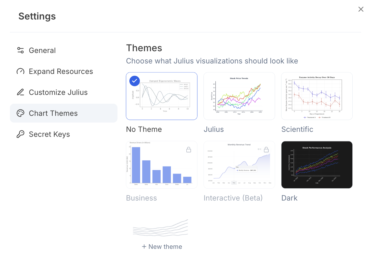 To get started:
* Open **Settings** in Julius.
* Navigate to the **Chart Themes** section.
* Choose from built-in presets like Scientific, Dark, or the Julius theme
* Or select `New theme` to create your own custom theme
* Select primary and background colors using a color picker or input **RGB, HSL, or HEX** codes
* Auto-generate a palette or manually set gradient and chart colors
* Customize chart details: **axes, fonts, borders, legends**, and more
Once created, your custom theme will automatically apply to new visualizations, making it easy to drop charts into decks, presentations, and reports that look on-brand.
To get started:
* Open **Settings** in Julius.
* Navigate to the **Chart Themes** section.
* Choose from built-in presets like Scientific, Dark, or the Julius theme
* Or select `New theme` to create your own custom theme
* Select primary and background colors using a color picker or input **RGB, HSL, or HEX** codes
* Auto-generate a palette or manually set gradient and chart colors
* Customize chart details: **axes, fonts, borders, legends**, and more
Once created, your custom theme will automatically apply to new visualizations, making it easy to drop charts into decks, presentations, and reports that look on-brand.